Japan, もう一度 by Giacomo Cattaneo

Ups, I ended up in Japan - again. I visited my brother, who is staying in Tokyo for an exchange, and kind of re-located my office there as well. Not that I have one in Boston, so it was not that different, I basically used different coffee shops and was fueled by ramen instead than by lobster rolls.

Even though I had my camera in the bag every single day (heavy!) I shot a total of... 3 pictures. Or at least, many failed attempts at the same picture resulted in a total of 3 final pictures. I'll use this blog to show you the before & after of a shot I particularly like, because I had been planning it in my head the whole week and somehow managed to get a great opportunity the last evening.

The story. 

Me and my brother were in Shibuya to this same shot for him (since he never posts anything of him when around the world, so I said "well let's take at least a cool picture of you in Tokyo"). Chance wanted that next to us was a couple - a model and a photographer - with a very similar idea. We started having a nice conversation, and when I kindly asked for the opportunity to use the model as subject instead of my brother (sorry I ditched you bro!), she got very excited and allowed me to do it. Thus, at every turn of the traffic lights turning green, we would run to the centre of Shibuya's crossing, known to be extremely "intense" with dozens of people crossing in all directions at the same time. She posed, we shot. However, she was posing for her photographer (fairly so I'd say!), but I needed her to do things differently. You see, I wanted to get a long-exposure shot so that people crossing would become blurred, yet she kept on smoothly moving from pose to pose to get a variety of angles for her sharp shots. This resulted in my first batches of pics to have her very blurred as well, like the people crossing behind her. Luckily, after seeing my frustration she was kind enough to pose for me once, stay very still, and granting me the shot in this blog. So, thank you so much _Mikiy_!!!

I never shot a model in my life - hey, it's fun! My style (and the picture) to be honest does not focus really on the model herself, rather on her being in a specific context. But it was a nice experience. I had to explain/apologize to her that the picture she could see then "out the camera" would get better after retouching, as it was shot dark on purpose (so to get the light signs behind her not completely blown out). Will send it to her ;)

The shot.

I wanted to use the opportunity to make a case for a recent piece of software I got, called Nik Collection. It has recently been bought by Google, and now it is FREE. And it's awesome. It's a collection of tools that allows you to selectively make changes to the picture through either Photoshop or Lightroom (e.g. with burning/dodging, or noise reduction) as well as using some great filters (both color and black&white). I think that if used in moderation, they can really upgrade the picture to another level. As of now I might be still a bit too enthusiastic and end up using them too heavily, reaching maybe too-instragram-like results, but hey, what's wrong with that? I like it, as it allows me to get the picture to look how I imagine it in my head. Do consider getting it, and do also watch this short tutorial for an overview of the tools available.

In the pictures below I show you 8 different steps the picture went through to look as it does, and I include which filter I used. 

#1 - ISO 50, 35mm, f/6.3, 0.5sec - this is the shot right out the camera. You see how dark it is, so that the signs on the upper part of the picture do not become white, yet the people moving are still blurred. This is why the ISO sensitivity is so low. I used a tripod, and set a 2s delay on my shutter release so that the camera does not vibrate when I press the button. 

#2 - This is the outcome of using the basic functions of Lightroom by recovering the shadows (this is clearly better if you shoot in RAW format), and by getting an overall balanced exposure. However, it is quite bland - especially her. She clearly does not stand out as she deserves!

#3 - Using Nik's Viveza, one can selectively burn (make darker) or dodge (make brighter) parts of the picture. In this case, I focused on her so that, compared to the rest of the image, she would stand out more. Yet, we are not there were I want... the picture lacks punch!

#4 - Using Nik's filter "Sunlight", I increased the the spotlight on her, as if I had some distant flash - which unfortunately I did not have =( Yet, the overall look still looks bland. Time to work on the background as well!

#5 - Nik's filter "cross-processing" gives a particular tone to highlight and shadows (check the link for description how it was done in the days with films). In this case, the shadows got a bit "bluer", while her skin tone stayed of the same tonality. This further increases the contrast between her (which I left untouched by the filter) and the background, color-wise, yet adding a specific "style" to the image. 

#6 - Nik's filter "bleach bypass" leads to more contrast and less saturation. In my case I actually kept most of the saturation high and only increased contrast a little. I only applied it to the background to increase a bit the dramatic effect, while leaving her smooth and not too contrasty.

#7 - As the background was looking a bit to strong, I decided to "wash it out" a bit again while maintaining its punch - yet in a subtle way. I did so by using the filter "Film efex faded", also not  applied to Miki. This kind of gave it a bit of "movie-like" appearance, which I really like!

Finally, I got to the final image and cropped it in square format, plus did a small high-pass filter in Photoshop to increase the details of her facial features and added a bit of vignette. Click to enlarge - I hope you like it! 


New York, New York! by Giacomo Cattaneo

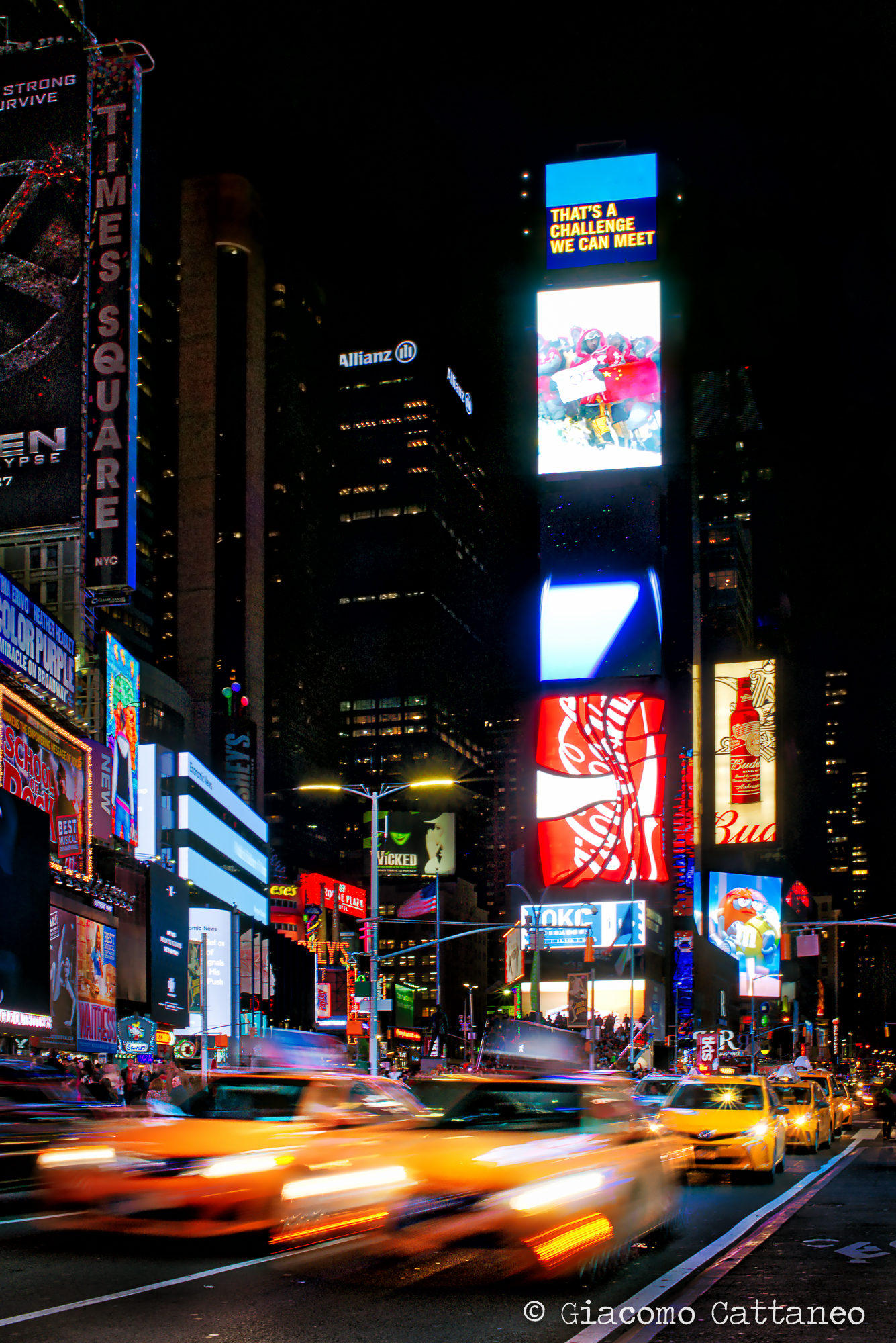
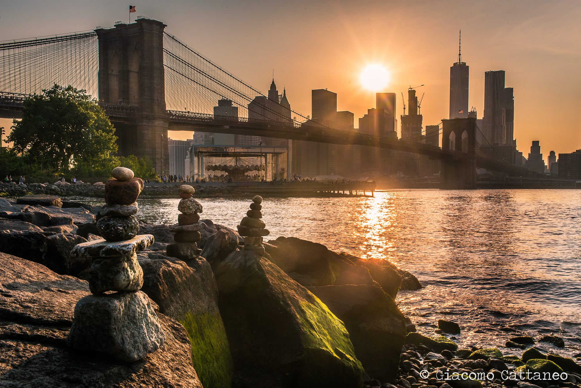
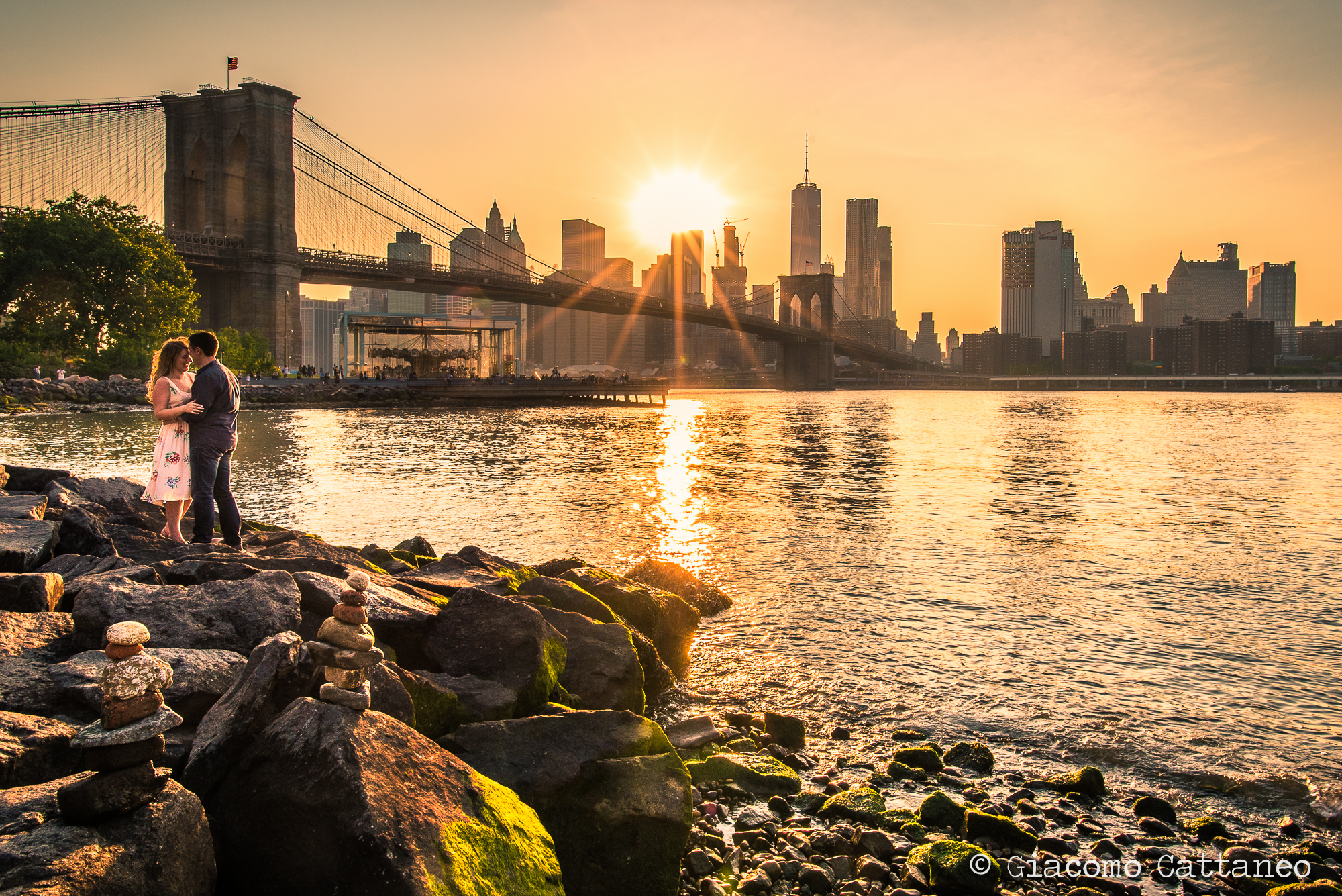
I had just a couple of days in New York, grateful to my dad for having come and visit! Also, I wanted to make up for the total lack of pictures from last time I visited The City, so I planned a couple of hours of walking around here and there. There were 2-3 pictures I knew I wanted to take (an HDR of Times Square, a picture of the Brooklyn Bridge and one down in the subway that I eventually forgot), but for the rest the plan was simply walking around different neighbourhoods and get the "street photographer" in me to come out. After a couple of hours and awkward attempts, I felt like slipping back (at least a tiny amount) into that "mode".

What is the street photography "mode"?

--> openness to your surrounding and people with a quick use of the camera to catch a good "lively" shot (and maybe symbolic) of what life happening on the streets is. Easier said than done, it's probably one of the most challenging ways of getting pictures - at least for me. It's the people who are most difficult to approach, yet are the core subject of street photography. If you have ever tried it yourself, you know how awkward it can get. These were the questions spinning wildly in my head when walking around in what I wanted to be "street photography mode": 1) "Should I keep my camera on me or in the bag?", 2) "Should I approach the person first asking to take a picture, or should I take it and ask permission to keep it afterward?", 3) "which focal length and aperture and shutter speed and ISO should I use?", 4) "....what the hell is a good & symbolic shot of the streets?". Well, I'll answer those questions myself (for myself) now! 

1) Bag or no bag? As always, it depends. My camera is pretty big and bulky, so I hold it in my hand with a strap instead of around the neck. This way... well, first of all I look less like a tourist (despite being a tourist). Second, I just think it's more comfortable instead of having it jump up and down on my chest, but this might be a personal preference. Third, I feel readier to both shoot or put it back in the bag. However (#1), I would say the best mode overall is to have the camera in the bag. Why is that? It's true you might miss some shots that if you were not ready that second, they are gone - but it's also true that with the camera in hand you'll take pictures of everything forgetting to look around to what surrounds you (instead of looking for the shot). This eventually leads to get a sort of understanding of what is around you, and grasping the meaning of what a "symbolic" shot could be. Especially in areas where the cultural gap between you and "the streets" is bigger, you don't wanna enter them as "the guy with the camera". Too hawk-ish. However (#2), in NYC nobody cared at all, the cultural gap was small, I did only have a couple of hours to go around, so... I mostly kept it in my hand. =P

Above: 20mm, ISO 1250, f/11, 1/1600 sec - clearly not the right settings (ISO way too high, and so the aperture - would have been nice to have a bit more bokeh (blurred background) around her). I was actually taking a picture of the fountain with the background, so that it the reason of the for the 20mm (wide-angle) and the settings. She just made her way across, so who am I not to portray her in all her frappucino's majesty? ;) So here again, having the camera out of the bag gave me one of those quick shots opportunities.

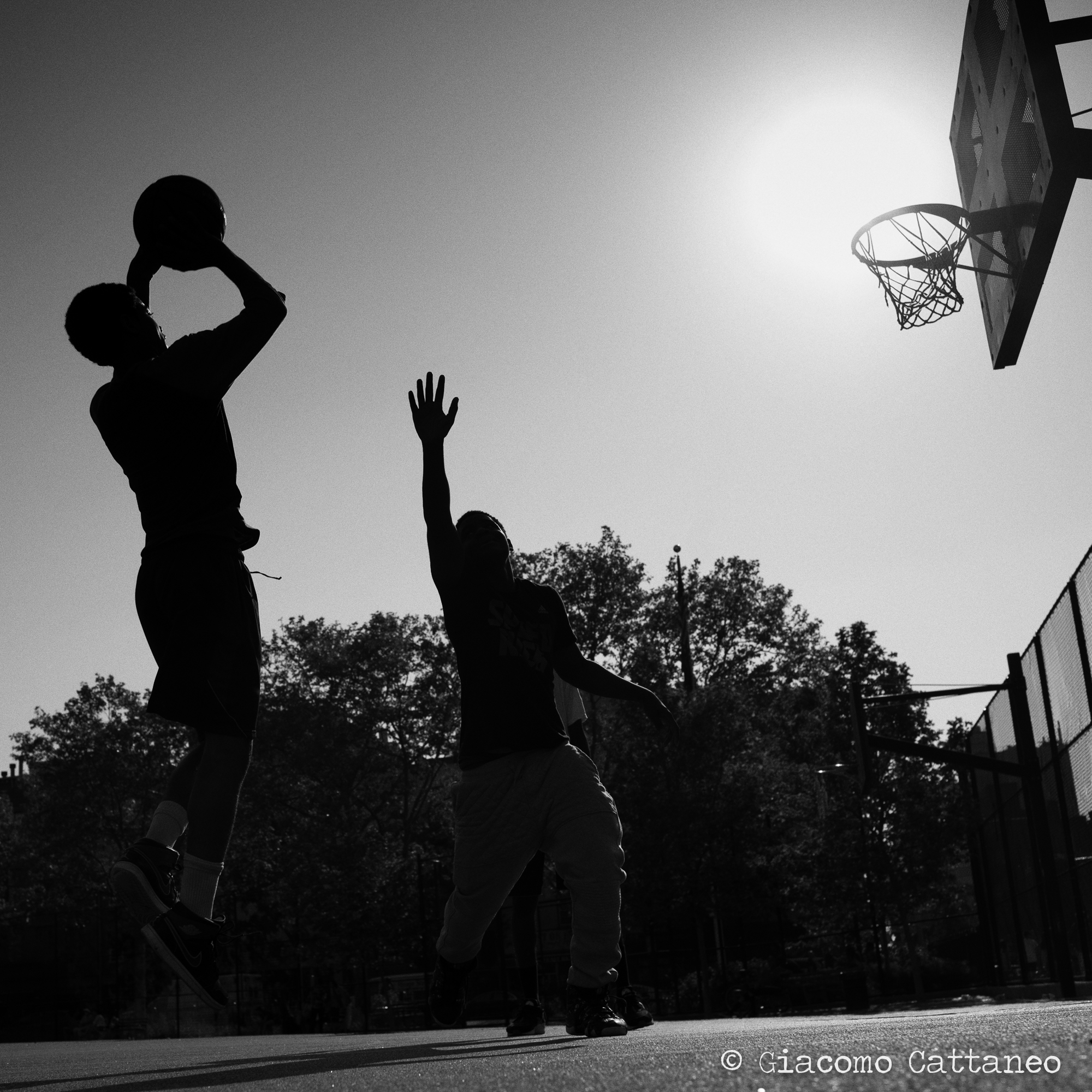
Below: 35mm, ISO 50, f/5.0, 1/1000 - I happened to come by a basketball court with my camera out, and the kids there asked me if I was a photographer or a tourist - I took out one of my visit cards, and told them that if they let me take some pictures of them playing their best game, I might publish them on my website later on. Guys, if you see this - I hope you like the pic ;)

2) How to approach people? Both ways! What I remember after 8 months of travel, is that I could talk to people so damn easily - thus the "total" openness. My camera, instead of a wall between me and the subjects, became the connection, either by shooting first and then approaching the person to show them the picture (you'd be surprised by how many people are happy to see themselves captured in a nice picture!) OR by talking to them first, getting to know them, their name, what they are doing and why, and then take a nice portrait. They will yield two different kind of images, but both are worth doing as the third option - taking the picture and going away - really leaves you with some bitter aftertaste. Also, you are missing out the most beautiful thing about street photography: understanding where you are. In the last years I did struggle a lot to approach people the way I did before. So I did not take pictures (still, don't do the 3rd option!!!). Nevertheless, this time I pushed myself a bit more and managed to talk to all the very different characters here below, turning these pictures into memories of a "real" moments. Totally worth it!

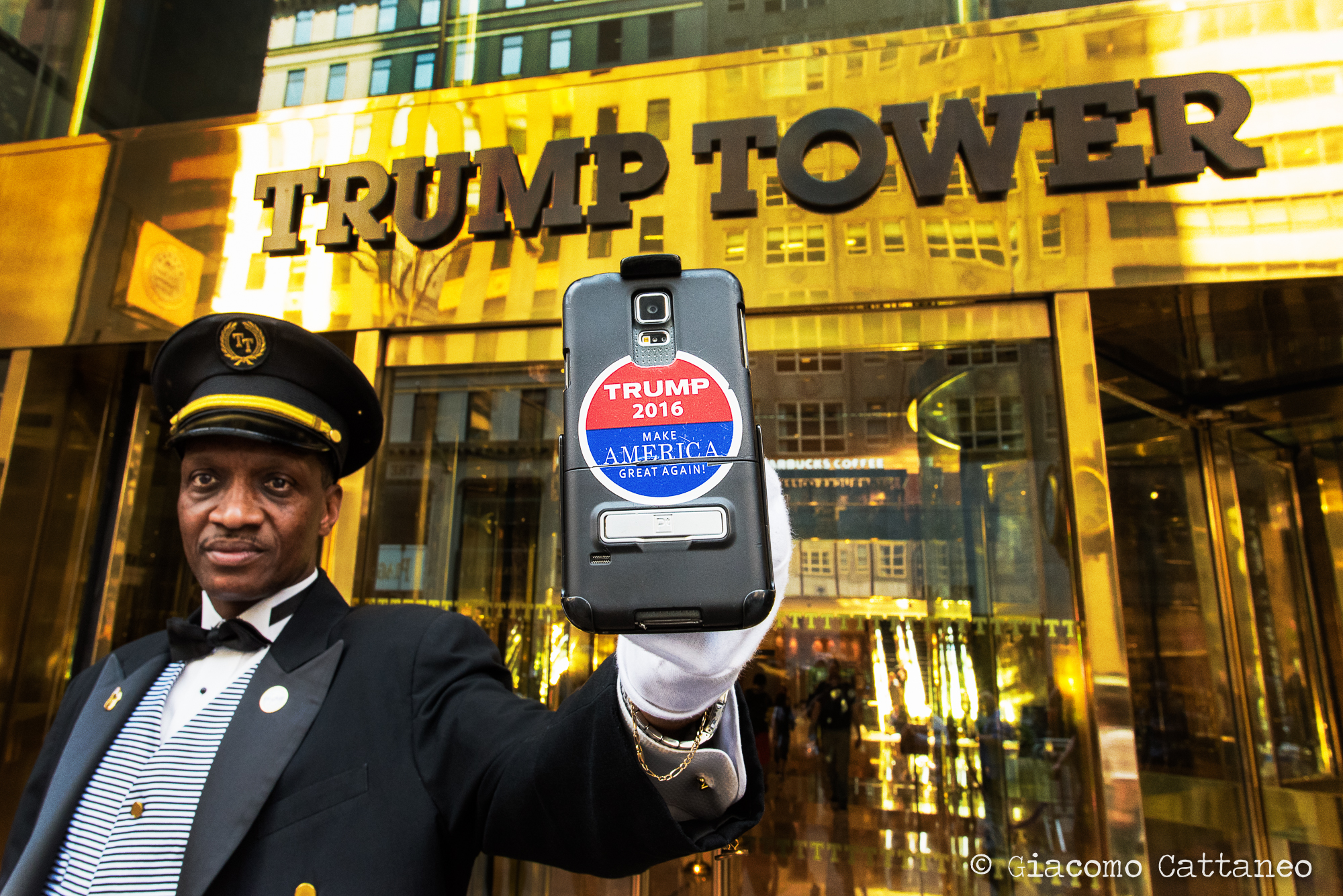
3) Which settings should I use? Well, guess what, it depends - again. Still, I had a "default mode" with my 35mm lens set at f/4-5 and ISO quite high-ish (400-800 depending on the time of the day). This granted me to get both subjects in the picture with a little bit of a background in any situation. A 50mm would be great as well, but if you want to catch some action and you are not exactly positioned in the right place, you might end up leaving a lot out of the frame - a 35mm will grant you to catch everything every time, leaving it for you to crop it afterwards. The fast aperture of f/4 or f/5 allows to get the subject in focus and the background blurred (bokeh) (which is a typical "look" for a picture taken on the street), while at the same time ensuring fast shutter speed and higher probabilities of getting the focus wrong, both key to get your subjects sharp. This reasons also goes for the high-ish ISO, despite lowering the overall quality (which does not really matter for these pictures), it grants you fast shutter speed. After that, style is up to you - with Ryan up above, I wanted the background with the buildings and taxis "closer" to him (thus a 50mm - after I first tried a 35mm), while for... damn it I forgot his name! Well, Mr. Trump up there, with a 35mm I would not get the BOOM! of the phone slapped in my face, which is what I was going for. Thus, I switched to a 20mm that magnifies the objects closer to you, and reduces in size those far away, hence giving me the look I was going for. If you want a better explanation of of focal lengths work on perspective, have a look at this video that despite being for motion picture, delivers a good pragmatic explanation.

4) What makes it a decent "street photography" shot? I guess everybody is entitled to have is own opinion on that, and they'd be right. As for me, the two pictures below speak to me more than the others. Why? Well... every good picture in my opinion tells a story. And compared to the others, the two below tell a more interesting one. That is what makes a good shot. Do I linger on the picture, or just move to the next? For that reason, I will not tell you anything, and let the pictures tell their stories themselves.

(Still, if you wanna know how I took the picture, there are some notes in between the pictures, even though that will somehow detract from the picture's power).

Above: 50mm, ISO 50, f/9.0, 1/5sec - I stood here for a well 20min using different lenses, different shutter speeds, and kind of experimenting to hold the camera very low touching the ground. Also, there is the Empire State Building in the background, but I cropped it out (whaaat?) as it took away the focus from the contrast between the homeless and the shopper. Also, I removed a small white sign on above his shoulders as it dragged away the eye from his hands. Ethical question, should I have, or not? I usually do not - yet, in some cases, if the essence of the picture remains the same one can have a certain leeway. As Steve McCurry has recently said in response to allegations of using photoshop to alter his pictures, "Some would say that was wrong, but I thought it was appropriate because the truth and integrity of the picture were maintained" - see the article here

Below: 35mm, ISO 1100, f/3.5, 1/40 - I was sipping coffee at Starbucks while working next to Times Square, while one of these guys that stand there to take pictures with you (the usual Spiderman and Batman) just passes me by to go to the toiled - Mickey Mouse! So... yeah, a bit embarrassed I ask the lady next to me if she could watch my computer for a sec, I grab my camera from the bag and head for the toilet (already awkward, why would anybody bring a big camera to the toilet?). I got there a bit too "early", meaning that the guy was there still pissing - and I just stood by with my camera. Of course you don't take the picture while he's pissing, cmon that would be too much. Yet, when I explained him what I wanted (imagine asking Mickey Mouse "hey dude, can I take a picture of you pissing" - that is what happened) he had a laugh and we set it up. 


Photographing the "icons"

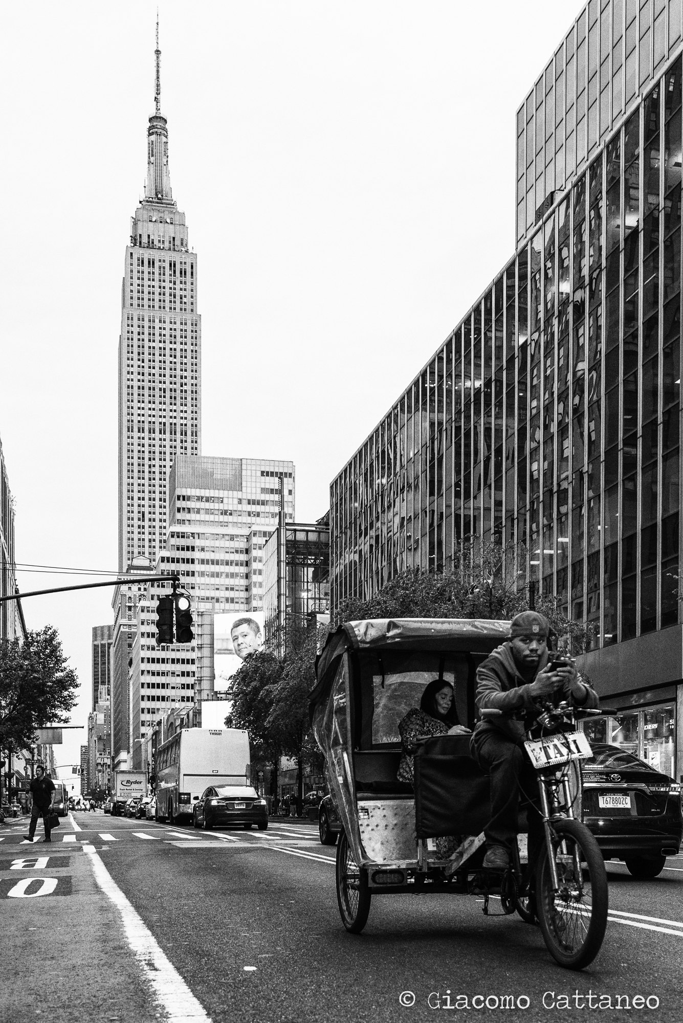
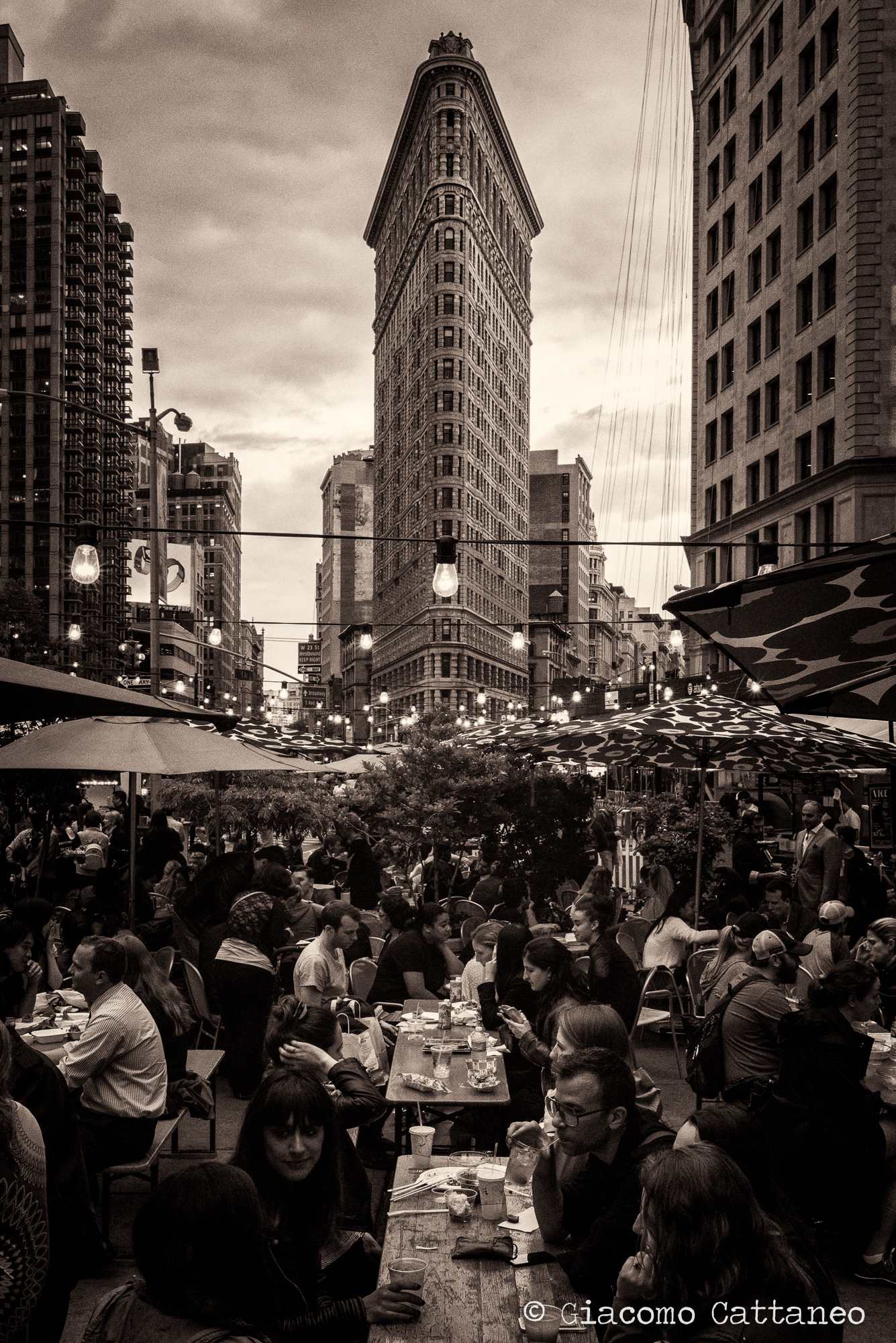
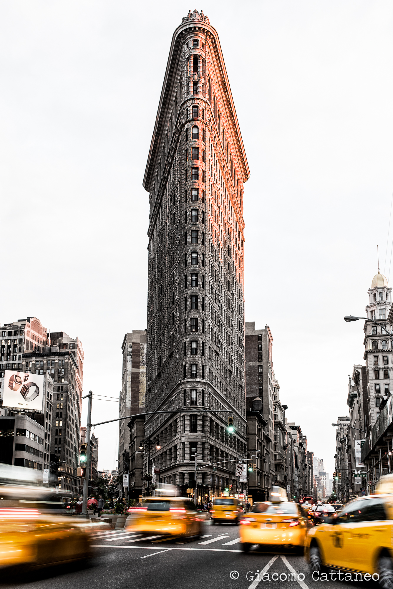
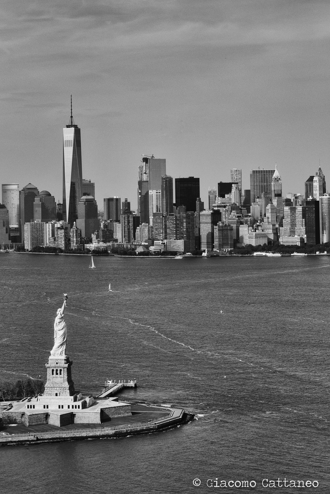
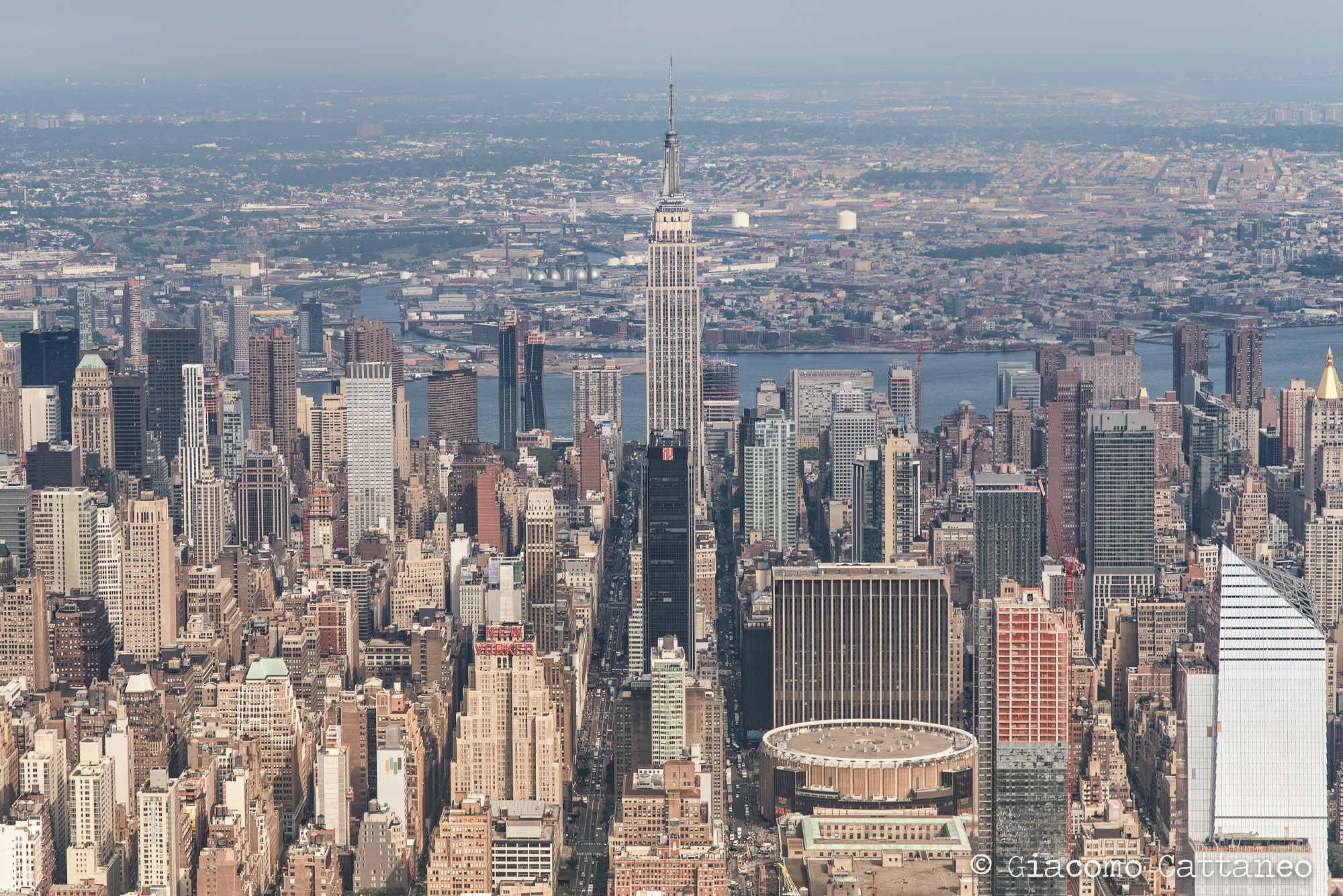
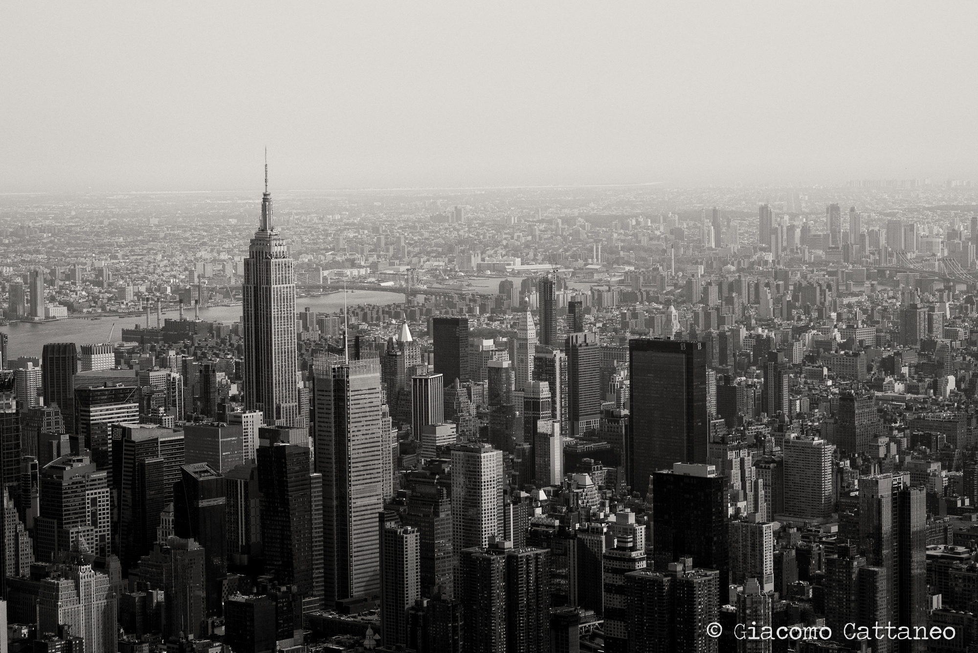
As in every great location, there is the street photography where you look for the symbols that make the daily lives of people, and there are the symbols for which the city is recognised worldwide, those that are on the travel magazines and books. Here below a gallery of my takes on such icons, some "you've seen already" (i.e. those with the yellow taxis for example):


Going BOLD with HDR

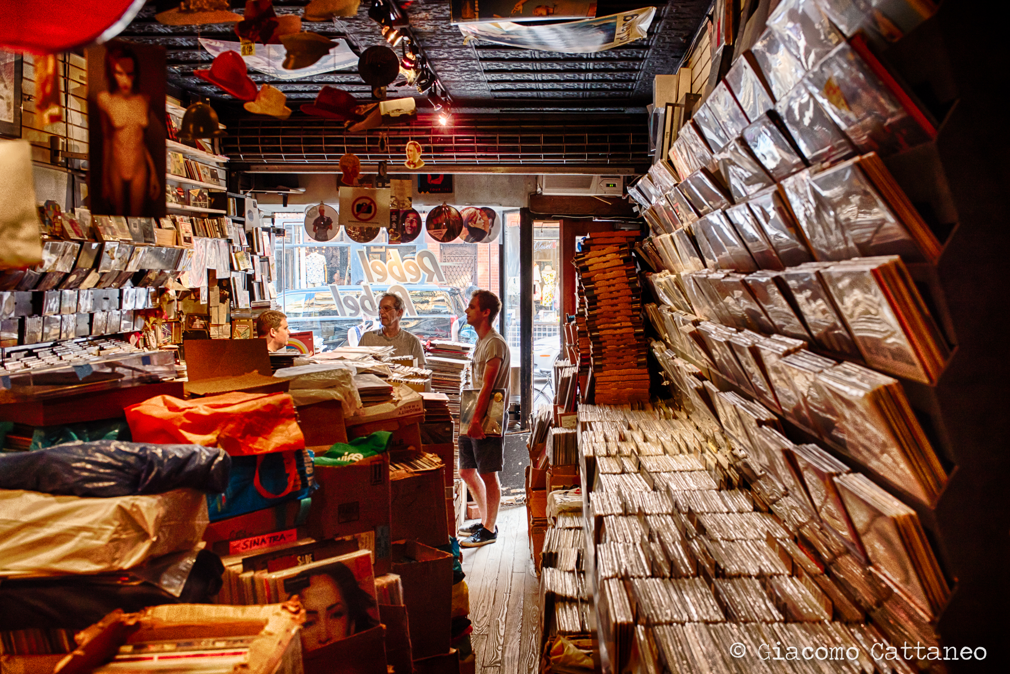
There was something I had been looking forward to do in NYC: HDR, high-dynamic-range photography. The concept is the following: the camera is not as good as the eye. While the eye can absorb and balance out all kinds of bright and dark colours at the same time, the camera can select only one in situations where they are at their extremes. Think about the usual struggle of taking a picture against the sun at sunset, and the frustration of either having the sun look good but the rest black in the foreground, or the foreground nicely exposed with a white-washed sky. Enter HDR ---> a process of combining multiple exposures (from dark to bright) into a single picture. Some of the pictures above of Brooklyn Bridge are an example of such. Not always they come out "right", and often look too artificial. I thus stay away from HDR most of the time. Yet, I felt like giving it a shot while being in NYC, and test out what I could achieve. Such experiments are below: on the left, inside a messy record shop in Greenwich Village made from one picture only, while the one on the right is again Brooklyn Bridge made from 5 pictures. By shooting in RAW format multiple exposures can be created from one (even though it's not the best way to do so) - it was useful in the case of the record shop, as I could not shoot 3 exposure without a tripod and the owner gave me permission to shot one (and only!) picture. For both I used a new software called Aurora, developed in collaboration with Trey Ratcliff, one hell of a photographer, who is also doing a very interesting show series about Becoming an Artist (with stories, techniques and how-to)

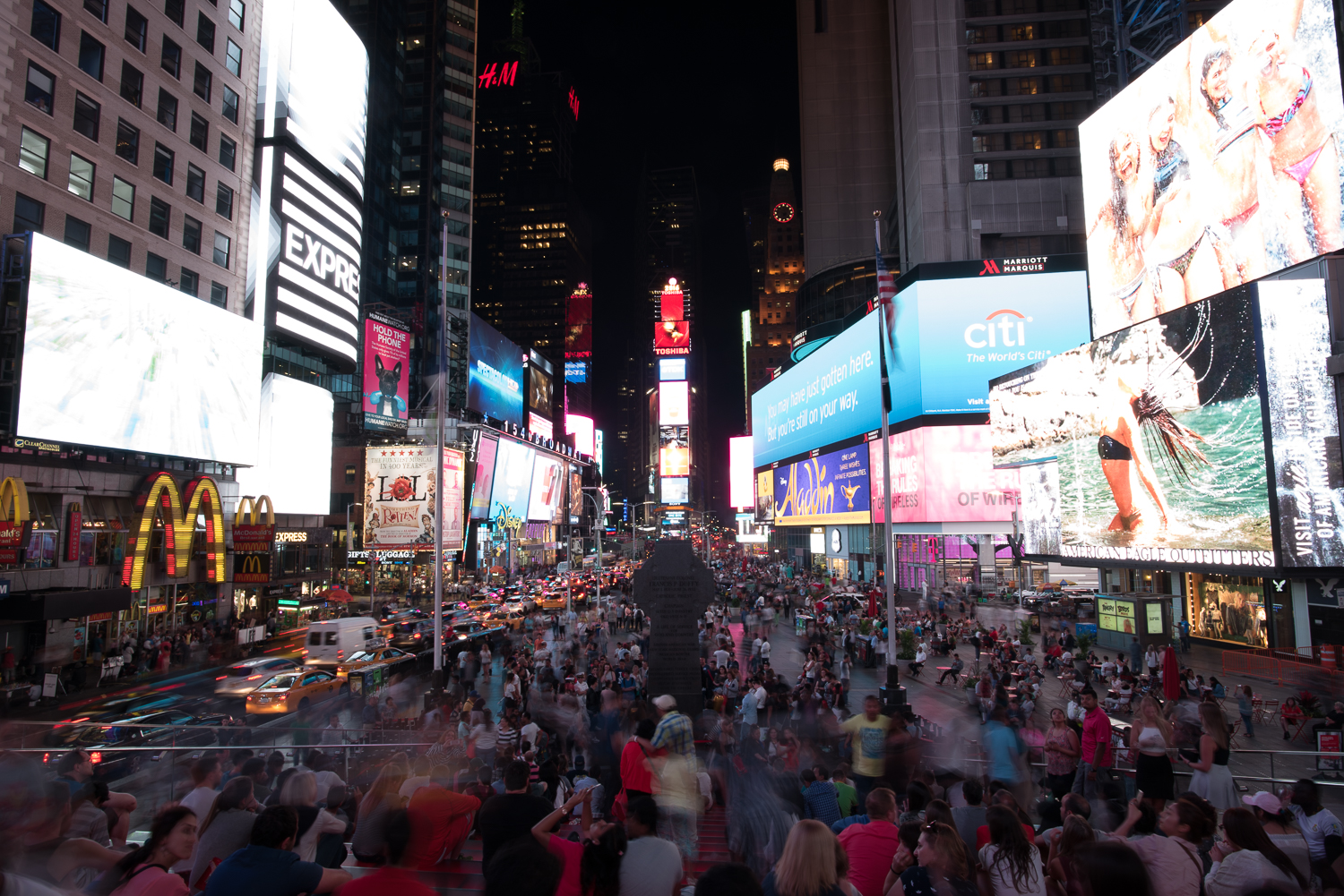
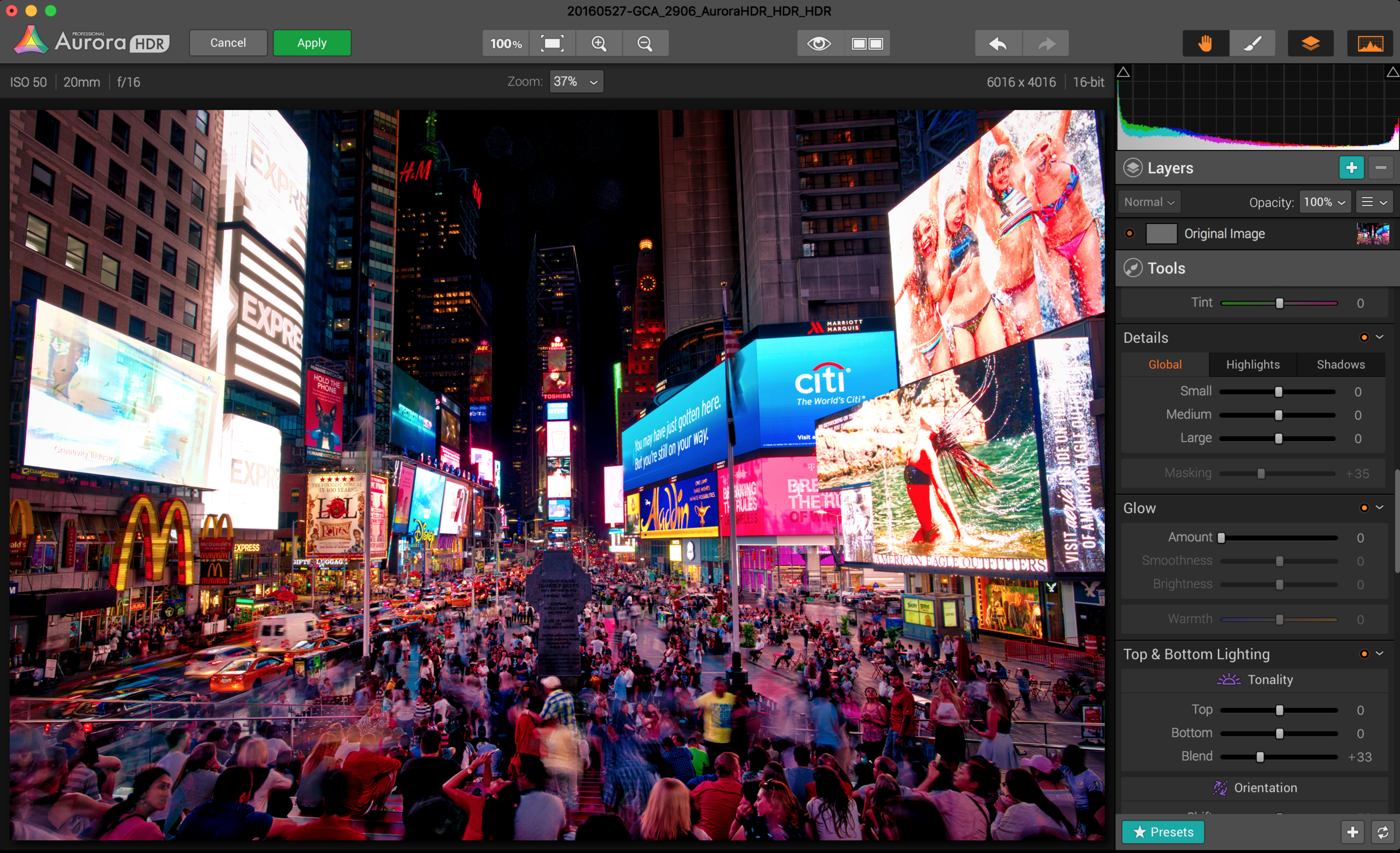
This one below is the picture I always wanted to take - Times Square, boomified. Normal camera settings won't really give great results in Times Square - it is much better to use the iPhone camera for whatever reason. True story. Yet, I knew this was the perfect HDR situation: strong light coming from all over the place, like having multiple sunsets, yet the scene in between should also be exposed enough not to be dark. Moreover, it's wiiiiide, so a panorama photo might also be the way to go. Thus, using a tripod, I combined 6 positions for 3 exposures each, a total of 18 pictures. Here is the result (do click on the image to enlarge it!):

Pretty cool, eh? Definitely over the top, but if I'm not allowed here to go for it, then when? As the process is quite interesting, let me guide you through it so you can see yourself. I'll be using another wide-angle picture that I did in case I could not stitch the panorama together (and almost failed at that, took me hours to fix):

1) Take 3 pictures with the "bracketing" mode in your camera (in mine is a small button called BKT). Use a tripod while setting up the camera to shoot automatically 3 pictures in a row through a remote controller or a 2sec delayed release (so it does not vibrate from you pressing the release button). Be careful to be in total manual mode! I had to throw away many series because I forgot something (like auto ISO, damn it!). Thus, manual mode & manual autofocus - basically the camera should not do anything on its own, but only take 3 pictures with different shutter speeds, the rest should stay the same:

2) combine them into 1 exposure with a software (Photoshop is not that good but it works, so does Lightroom). This is the screenshot from within Aurora on the left once imported into the software, while on the right is after I've applied some tweaks to achieve the look I wanted (the software uses information from 3 pictures simultaneously to achieve that) - note how both the screens and the people are now visible and of similar exposure?

3) Still, there is a problem - some of the screens had rotating images, so that while taking the shots they changed. Also, the HDR somehow did not really made sense of all that light, so that many of the screens look better in the darker of the image. What you can do then now is to "paint" the dark image on top of the newly created HDR with photoshop with a mask that will only select the screens areas. See this here below, plus the final result:


Final result out of 3 exposures and the use of both Aurora HDR and Photoshop - Times Square, baby!

So, this is it. Quite a long post for only 2-3 days of pictures, my apologies. Not that anybody will read this through - if you do and read this, let me know and a beer is on me!!! =) 

Ciao, baci & abbracci!

Giacomo

ただいま!!! Back to Japan, my favorite place by Giacomo Cattaneo

In October 2015 I had the chance to go back to Japan, "my favorite place". I believe that everybody that has traveled a bit has found that place about which he/she becomes totally biased. Everything - also objectively doubtful ones - become a source of fascination, wonder and magic. Many have fallen in love with Italy, some would get on a plane today for the US, while others swear they would start a life in South America tomorrow. I got the Japan bug... I simply love it all: the stillness of hidden temples in Kyoto, the nerdy weirdness of Akihabara. The chaotic urban scenery of Shibuya, the breathtaking views of Mt. Fuji's landscapes. Add the people and the food, and you have what I call a whole spectrum experience, meaning that you get experiences at both extremes of any spectrum you can name.

I might be biased, but the other person that joined me in this short trip was not - actually, she might have been fed up with it even before leaving Switzerland. I bugged my girlfriend about Japan for way too long, so she almost had to come and see for herself. Would she like it the same way I did the first time? But also, would I like visiting the exact same places twice? Well, it turned out that yes, we both loved it (again). Maybe for different reasons, but also for many similar ones.

As this is supposedly a photography blog, I'll get into it. I might pop some stories about the trip as we go... so, photography. I am a bit confused, to be honest. I don't really know what to think about them... I like some of them, but not many. I think the general problem is that I wanted to get very good pictures, because I have a new camera, I know the places already, and I knew what I wanted to capture. I was supposed to, right? I wanted to get everything in the frame - the people, the place, the atmosphere. Not easy, and often beyond what I can do. Many thus ended up being very "tourist-ish". They don't compare even slightly to the ones I shot during my world trip, where I had the time and the mind for it. The fact that we were a bit on a rush to show my girlfriend all I wanted to show her did not give me the proper time to figure out how to capture the scene. Oh well... I guess I'll have to go back once again!!! =P 

Now, about the pictures themselves. The process many have gone through is the usual combo of Lightroom adjustments + Photoshop retouches (50% gray overlay & localized high-pass filter). Nothing much more, if not that while taking the pictures, similarly to what I had done in the "US trip" pictures, I took often dark pictures so that I would not lose details in the highlights (especially in the street signs in the night shots). It's then easy through Lightroom to bring out the shadows again... For example, let's take this picture at Akihabara right out of the camera:

ISO 800, 35mm, f/10, 1/15 sec

With Lightroom adjustments

And this last one is with Photoshop re-touching: notice how the people, despite being blurred, now pop up much more, or how the signs above on the buildings are much sharper and brighter, rather than dull. If you see the sequence, it might seem like the one here below is "too much", but if I had shown it to you without the previous ones, you would have accepted it as "normal". Maybe =P Do click on the image to enlarge it!

Here below I post some other pictures of urban landscapes / moments that have been under a similar process:

ISO 400, 35mm, f/10, 1/3 sec - Shibuya. You can clearly see the (in)famous Shibuya 109 in the background, temple of teenage girls shopping! Here I was leaning against a pole, and for 1/3 sec that's not good at all - see how blurry the guy is? And I cut his feet!!! damn it...

ISO 800, 35mm, f/4.5, 1/10 sec - Ueno, lovely backstreets filled with izakaya and small restaurants. If I remember correctly, we had an amazing curry tonkatsu! gnammy!

ISO 1000, 20mm, f/7.1, 0.6 sec - Ginzan Onsen - a lovely onsen (hotspring) town, with ryokans on each side. The one on the right is Fujiya Inn, a ryokan refurbished in 2006 by Kengo Kuma, a renowned Japanese architect. Beautiful, so beautiful - but out of our budget ;)

ISO 800, 35mm, f/4.5, 1/160 sec - Pachinko!!! No comment (you could not hear it as it's way too loud in here!!!)

ISO 320, 85mm, f/3.5, 1/400 sec - Elvis gang at Yoyogi park, Tokyo. Still feeling the vibe...

ISO 400, 85mm, f/4.0, 1/320 sec - Kyoto

A very similar process can be applied to people as well, as you can see in the example below. It's almost an extreme example, where "I lost control" and definitely went overboard with the Photoshop retouching, but... don't know, just felt like going a bit artificial ;) You definitely won't like the last one after seeing where it comes from, it's just "too much".

ISO 500, 35mm, f/2.5, 1/50 sec - Fushimi Inari shrine, Kyoto & Terry

With Lightroom adjustments

With Photoshop re-touching: making the red doors darker, Terry (too) much brighter, increasing the sharpness despite the blurriness (the shot was not fast enough!).

Here below a few other examples:

ISO 500, 35mm, f/2.8, 1/40 sec - Kanazawa, Kaikaro Teahouse

ISO 400, 85mm, f/4.0, 1/640 sec - Kyoto, wedding pictures frenzy!

ISO 400, 85mm, f/4.0, 1/60 sec - Kyoto. My favourite tourists! It's customary for Japanese girls who visit Kyoto to take out their brightest kimonos and stroll the streets in such a fashion. So they first asked me if I could take a picture of them, and then asked them if I could do the same with my camera. Picture-wise, shooting with an 85mm is such a joy for portraits, as the foreground and background collapse much closer, and the effect on people's features is much more flattering. I also unsaturated the background, so to have their kimonos stand out even more.

Last but not least, a couple of pictures from around Japan, more on the "quiet" side of things.

ISO 50, 35mm, f/16, 0.6 sec - Ginzan Onsen

ISO 500, 20mm, f/13, 1/60 sec - Kyoto, Kennin-ji

ISO 500, 20mm, f/13, 1/250 sec - Kyoto, Kennin-ji

ISO 250, 35mm, f/14, 1/80 sec - Kanazawa, Kenroku-en

I'd like to conclude with a nice story, which is a fortunate encounter of "the" geisha I met 3 years ago in Kanazawa, and that we were fortunate enough to meet again. As I pre-planned our visit to Kaikaro's Teahouse in Kanazawa for a tourist performance, I knew I would meet the owner - a lovely lady that was so kind to invite me to watch a private performance behind rice-paper doors during my last trip - so I brought chocolate for them. I did not know I would have the pleasure to meet Suzuka herself again! I was lucky enough to have a visit card of my website with me, which pictures her! This is the result ;)

ISO 500, 85mm, f/3.5, 1/30 sec - Suzuka @ Kaikaro Teahouse. Not a great picture (spotlights created too strong shadows), but great memory.

Roadtripping in the US (well, 3 days) by Giacomo Cattaneo

After attending a conference in Denver, I embarked on an intense and national parks - packed roadtrip with a fun group of colleagues / friends, crossing Colorado, Utah, Arizona, Nevada (well, Las Vegas, but what else is there!?!?) aiming for Los Angeles. We spent days driving 6-9 hours, drifting by amazing landscapes, eventually finding a motel on-the-road - a "real" US roadtrip, at least in my stereotypical imagination, as this was my first US visit. However, every once in a while - and the main reason to drive across the states - we reached our selected national parks. And my (our) mind was blown to pieces! As a "villager" from tiny Switzerland, the first thing that one say about the places we visited is... SIIIIIZE:BIIIIIG!!! Definitely impressed, so much that this short trip seemed to be worth it a couple of weeks of travelling - well done guys, we definitely made the best of it! 

Here below I put some of my favourite pictures, plus a few comments on what I wanted to get, or how I edited them. It was my first time using my new Nikon D750, plus the new prime lenses. To be honest, I did struggle a bit especially in understanding, based on the picture I wanted to take, which lens would be more appropriate. After putting on most the times the wrong one, I slowly started to get the gist of it. The bigger difference, besides the "zoom" (how close or far the subject is), is the perspective: how much the elements in front of the camera collapse onto one another or they appear far from each other. This video is quite a good explanation, check it out! 

I'd love to hear your comments about the pictures, what do you like and especially what you think I could have done differently to achieve a better outcome.

Rocky Mountains National Park, Colorado

Our first stop outside of Denver, it was a bliss after 4 days locked in a hotel. Strong light of mid-afternoon, my first shot at using my new camera... did not really know how to handle it! 
Rocky Mountains National Park, Bear Lake - ISO 200, 20mm, f/14, 1/125 sec

For the picture above, I had in mind those great shots where the elements under the lake are very vivid. The outcome is not really close to what I wanted. The light is too strong, sunset would have been so much better. 

Rocky Mountains National Park - ISO 50, 20mm, f/16, 1/40 sec

I liked the idea with the reflection, the puddle of water was no large than 15cm. With the 20mm lens I could really get much of it in. Happy I got enough reflection in the water, but had to "take it out" with the clarity slider in Lightroom, plus some dodging/burning.

Bryce Canyon National Park, Utah

Bryce Canyon National Park - ISO 50, 20mm, f/14, 1/20 sec

This one you gotta enlarge it, it's much more impressive the bigger it is on your screen. Bryce Canyon was a breath-taking view, did not really know what to expect and it really hit me in the face when we could look beyond the ridge. Unluckily, the sun sets behind your backs, so that the canyon in the evening is mostly in the shadows. I can only imagine how magical it might get during the sunrise, with the red stone shining bright! The struggle in these pictures was then to get out as much as possible from the shadows, and balance it with the clear sky - so, you can perceive a huge deal of post-processing. Almost to much for my taste, but decided to give it a shot. Especially in the one below, it looks like one of those pumped up desktop background I never really liked. Still, the less edited one was so underwhelming with all such beauty in the shadow, that I went for the pumped up version - I beg for forgiveness ;)
Bryce Canyon National Park - ISO 250, 20mm, f/13, 1/80 sec

Bryce National Canyon - ISO 400, 35mm, f/14, 1/3 sec

Antilope Canyon, Arizona

Ah, the Antilope. Home of the most expensive picture ever sold. I really felt like a kid in a playground in this place - a canyon dug out of soft red stone into sensual curves, you could point the camera anywhere and it would be a great shot. This also means that getting that picture, a bit special, was a no-go - still, everybody is happy to have the same picture as person walking in front of you. We went to the lower-part of the canyon, so not where the famous "phantasm" picture was taken (that'd be the upper-part). Hence, no rays of light for us ;)

The trick in this case was for me to take very dark pictures, so that the light from the ridge above our heads would not blurry its borders as too intense - basically, trying to stay in the middle of the histogram away from both its black&white ends. The pictures on camera were for this reason very dark, but it was then easy to restore the shadows into their original colours in Lightroom. Actually, the camera in this case picked up even more colours than the human eye - what you see below are not ultra-saturated shots! I retouched them very little, believe me or not. I put four of my favourites, but as these get close to being abstract pictures, it's a real matter of taste what you like - I preferred focusing on details and particular shapes/colours using a 35mm rather than a wide angle. 

Antilope Canyon - ISO 500, 35mm, f/8, 1/13 sec

Antilope Canyon - ISO 500, 35mm, f/8, 1/10sec

Antilope Canyon - ISO 500, 35mm, f/8, 1/20 sec

Antilope Canyon - ISO 640, 35mm, f/7.1, 1/25 sec

Extra here below is the shot of the Horseshoe bend of the Colorado River, not far from the Antilope canyon - to be honest, I never thought I would suffer so much of heights. This place proved me wrong!

Horseshoe Bend, Colorado River - ISO 50, 2mm, f/16, 1/40 sec

Grand Canyon, North Rim, Arizona

I always underestimated the Grand Canyon. No picture I saw was comparable to what I saw with my own eyes... majestic. Really, really majestic. Do you remember what I wrote in the beginning about the size being biiig in US? I think it's mainly because of the Grand Canyon I reckon. Plus, you get there by crossing forests like the one in the first picture here below, which makes it even more unexpected. For the picture below I used a 20mm, a "typical" landscape shot: foreground leading you to a subject that catches your eye that sits in an immense and beautiful landscape. Classic, but somehow I like it as it came out of nowhere expected, rather "on the way".

Somewhere on the way to the Grand Canyon - ISO 200, 20mm, f/16, 1/160 sec

Grand Canyon, North Rim - ISO 200, 35mm, F/16, 1/100 sec

Here above I used a filter. Yeah, like those on instagram... why? boh. But the warmth of the colours now, the light, they more resemble what I have as a memory of the place, and so I feel comfortable in altering the colours. Your take?

One the way from the Grand Canyon towards Las Vegas - ISO 500, 20mm, f/8, 1/8 sec

Los Angeles, California

Gné, these last two pictures are just some random shots from around LA - the first at Malibu, the second Venice Beach. Nothing fancy, but they conclude the trip and I don't have better ones eheh! The first one I wanted to capture the "baywatch" feeling, but instead of Pamela Anderson I got this Abercrombie&Fitch dude - I was disappointed! Plus, I had to wait for him to do something, as I really wanted him to interact with the red rescue-thingy, but he definitely took his time. The second, is just an "impression" of Venice Beach, where people stroll and skate around - I wanted to get closer to them, but they were way faster than I was and I would have really looked like a creep! So, what do you do when the picture is not that great? Heavy filter once again ahah =P

Malibu - ISO 500, 35mm, f/8, 1/320 sec

Venice Beach - ISO 200, 35mm, f/8, 1/1250 sec

I really enjoyed toying around with the new camera and lenses, and I do enjoy some of the pictures. What are your thoughts, which picture do you like and why? Especially, which one do you like less, and what would you have done differently?

Now I've gotta get to work on the pics from Japan - hopefully I can write such post soon enough!

Ciao a tutti,

Giacomo

Mmmmh, what a tasty set-up! by Giacomo Cattaneo

It's definitely been a while since last post - more than one year! What happened? mmmmh, PhD life got in the way ;) Had overall less time for photography, a the motivation dropped all together.   I felt particularly un-inspired, never took up the camera anywhere. When I thought I needed a new boost, I did what many might not necessarily consider the best move - I bought a new camera! Hell yeah!

I've always dreamed of moving up to a FX (full-frame) camera, a tier above my beloved D90 (a so called DX). A full frame camera implies a larger sensor, etc. etc. - not the place here to make the case for it, but it's more "professional". I've felt I wanted more in terms of technology than what my original DSLR could offer, especially in terms of low-light capabilities. Moreover, as the quality of a picture comes primarily from the lenses and not the camera itself, I was ready to invest something in that area. Well, actually the quality of a picture comes from the eye of the photographer, as this very funny series of videos with pro photographers with cheap lenses clearly shows. Still, I felt that it was time to upgrade my gear. Lenses are expensive, and you can either buy those for FXs or DXs - but they might not be interchangeable. Therefore, after years of procrastination and savings, I made the jump into the FX world, and invested in good lenses - look at how much beauty on a single picture!!!

This is my new set-up: a Nikon D750, and three prime lenses: 20mm, 35mm and 85mm (actually I also have a 50mm that I used already in my trips). By prime lenses I mean lenses with a fixed focal length, with which you cannot zoom. The quality of the picture is higher due to fewer "glasses" within the lens itself, which decreases distortion and other effects more common of zoom lenses. Moreover, as you cannot zoom in/out, you gotta move much more! And this is fun, more engaging, leads you to think exactly what you want to capture and to understand the difference between a 20mm or a 35mm. Overall, I'm very happy with my purchase, and believe I can become a better amateur photographer. But what's most important for me now is the regained motivation to shoot pictures!

In the following two posts I'll tell you about two recent trips in the US and Japan, and my first experiments with the new set up - looking forward to write about them ;)

South Africa - "scenery, scenery!" (+ animals!) by Giacomo Cattaneo

Hello people,

I've had the luck to travel for 2 weeks to South Africa recently, and wanted to share some photo-stories with you. SA is, as my friend Hennie from Cape Town said, "scenery scenery scenery". And indeed it is - I basically have no shot of people. When looking at my folder, I only see landscapes and wildlife. This allowed (or forced?) me to experiment a bit more with two more technical aspects: the first, is composition; the second, camera settings. 

1) Composition + landscapes: 

The rule goes that for a landscape not to be flat, there should be some guiding lines and perspectives leading you into the picture. Not finding that many "physical" lines like railways or streets, I tried to give a sense of depth by including an object in the foreground of the picture, that would give a sense of space and distance from the object that is the landscape behind it. The main challenge was for me to decide where to put the focus, even though through the concept of hyperfocal distance, which defines a focus distance for a defined aperture that leads to the longest depth of field (i.e. "everything is in focus"). I did not manage to get it often, also because I did not know that by not using the "preview" function the viewfinder will show you the shortest focal length (i.e. not everything will be in focus, despite small apertures and hyperfocal distance). So I kind of decided every time if I wanted the foreground to be in focus, or the background - not very professional. And I always went for the foreground on focus. These are two examples:

ISO 200, 18mm, f 9.0, 1/160 sec - probably the loss in sharpness in the background is a bit too much. Here clearly the focus should have been a bit beyond the white flowers in the foreground. 

ISO 100, 18mm, f 14, 1/160sec - photomerge of 4 vertical shots that did not work well: look at the sea right above the white flower, it's split. and overall the horizon is not straight. 

2) Camera settings + landscape

When it comes to camera settings and landscape, I had to focus on two things: ultra-bright clouds, and landscapes against the sun, but with a foreground to be visible. When it come to ultra-bright clouds, the problem is that no automatic setting in the camera will be able to step down the exposure enough, so the clouds will often be pure white shapes. No editing will be able to recover the details, and so the only way is to go full manual and hope that the shadows contains enough details to be recovered. Same goes in the case of shots against the sun, for which one would like to recover the foreground in the shadows. 

ISO 100, 18mm, f 11, 1/250 sec - this was a real challenge. I wanted to keep the camera open as long as possible to give a sense of movement in the clouds, but the light was just too bright. My ND filter was... down in my room at the hotel. Moreover, despite the great landscape, it was very difficult to find a spot that would give a proper sense of perspective as discussed above, so here the rocks do not really lead into the picture. 

ISO 400, 32mm, f 10, 1/800 sec - I've tried an HDR, but the "fake" feeling that it gives really does not match the natural scene. So I've had to rely on the shadow recovery, which is still ok-ish. Still, I cannot go above ISO 400 with my camera (Nikon D90), so this is the best I can get. 

3) Composition + wildlife

When it comes to wildlife, life isn't easy in my opinion. Because we've seen thousands of pictures of the same animal, and he probably won't do a backflip right when in front of us because we're special. So one needs to experiment a bit more than just taking a frontal shot, and try different angles, crops... experiment. Often the result is still lame, but sometimes one can get a shot that even if little, captures our attention. Let me show you a few examples where I tried to experiment more: ostriches and elephants are animals that despite being quite interesting and beautiful, are not very "active" when it comes to taking pictures. In the case of ostriches, I found one that was wandering by itself around the Cape of Good Hope, and I won't try to answer the question about what he was doing there: 

ISO 250, 44mm, f 5.0, 1/640

That is an ostrich. Nothing less, but also nothing more. There is no need for a second look to this picture, or the other 50 that I shot of it when there. Back home, I was partially disappointed that I had had an ostrich as a subject, and did not pull off anything better. So a few days later, while driving down the Garden Route, we passed by an ostrich farm, and though I could experiment a bit more. Getting so close to them made me realise how funny looking they actually were, with their dull expression and the long neck. So I focused on that, or the fact that they only acted as a group and never individually, so I laid down on the ground to give them the look "you've come to the wrong neighbourhood mothaf****". Not that these pictures are great, but I definitely prefer them over the one above!

ISO 200, 200mm, f 14, 1/80 sec - no idea why I used f 14, while a larger aperture would have decreased the risk of a blurry picture with faster shutter speed. Mah.

ISO 200, 18mm, f 5.0, 1/250 - the great risks of a photographer: using your finger as a tasty worm-ish bait to lure their heads closer to the camera. 

ISO 200, 18mm, f 5.0, 1/160 - the one in the middle clearly suffered from a sore throat, but also the bossiest. 

Similar goes for the elephants. We had the chance to go on a small safari in Addo's National Park, where elephants despite being quite wild have been better protected from poachers, and so are less aggressive towards humans. Here again, shooting something original is practically impossible. Especially if you are forced to remain on a small jeep with other 6 people that are fighting for a space on the side of the car where the elephants are. This is one of the first pictures:

ISO 200, 90mm, f 5.3, 1/400 sec

Yei, elephants! Probably everybody that came to the national park has this picture. I don't think I've succeeded in shooting something original, but maybe a few less did take the following shots...? Who knows. I still think that focusing on the details of such a large animal and giving up having it wholly in the picture made sense. 

ISO 200, 200mm, f 5.6, 1/800 - dumbo!

ISO 400, 150mm, f 5.6, 1/1000 sec

BONUS! Giraffe matryoshka =)

4) Camera settings + wildlife

What I struggled mostly during this trip was the encounter with the lions. We found them later in the day, behind a hill while the sun was setting or was already gone. This implied very low light availability. This led me to have a picture that despite being one of the greatest moments of the trip (the "family reunion" of the pack, with the male finally awake) had extremely dull colours, and a potential I could not really bring out through the post-processing. I think I've played around with all the sliders of Lightroom, and still I am not very satisfied. So I think that either one is a master in editing, or not even Photoshop will save a picture that was taken wrong. I want anyways to share it, as the waking up of the big male was a moment that will stay impress in my mind for a loooong time. 

ISO 400, 80mm, f 5.0, 1/100 sec - please note the paw of the cub. I never felt as much in a documentary as in this moment. Still, due to the light conditions I had to go full manual, and hope not to shake too much given the slow shutter speed. 

The other challenge of dim light is the balance between high ISO, long focal length (200mm) and shutter speed. Despite loving my dear Nikon D90, I know that if I go beyond ISO 400 with low light, I get too much noise for my taste. On the other hand, I needed to get as close as possible to the male lion, because I had this "close-up" shot in mind, so I needed fast-shutter speed. Waaaaah, I was really struggling. So I put all my faith in my dear camera, and shot very dark pictures, so dark that I could barely make out the lion in the preview of the camera, and hoped to recover enough details from the shadows. It required a bit more of editing, and to cover some faults in the recovery process I played around a bit more than usual with the colours and saturation, but It proved to be the right choice, as I managed to get an acceptable result, at least for my taste.

ISO 400, 170mm, f 5.6, 1/125 sec - His majesty the King. 

I put here two additional pictures for which i don't have any particular comment. Just pictures I guess ;)

ISO 250, 90mm, f 5.3, 1/200

ISO 100, 55mm, f 9.0, 1/250 sec

This was my South Africa - I was happy to have the camera back into my hands as months had passed since the last time. Maybe I did not get so many pictures that are for me "memorable" (despite the holiday itself being memorable!), but for sure I had the chance to experiment a bit more than usual and get better with techniques (mostly by failing), even though there is still sooo much to learn... will have to travel again soon I guess ;)

Cheers,

Giacomo


(non-)Holiday Pictures by Giacomo Cattaneo

Dear everybody,

Recently I enjoyed a week in the south of France, and brought my camera with me. Besides the many usual holiday pictures of me and my brother making funny faces and the usual sunsets, I sometimes took the opportunity to shoot some less-holiday-ish pictures given the great locations we visited. 

Boats: a red flag and the chase.

A red flag.

A red flag.

The chase

The chase

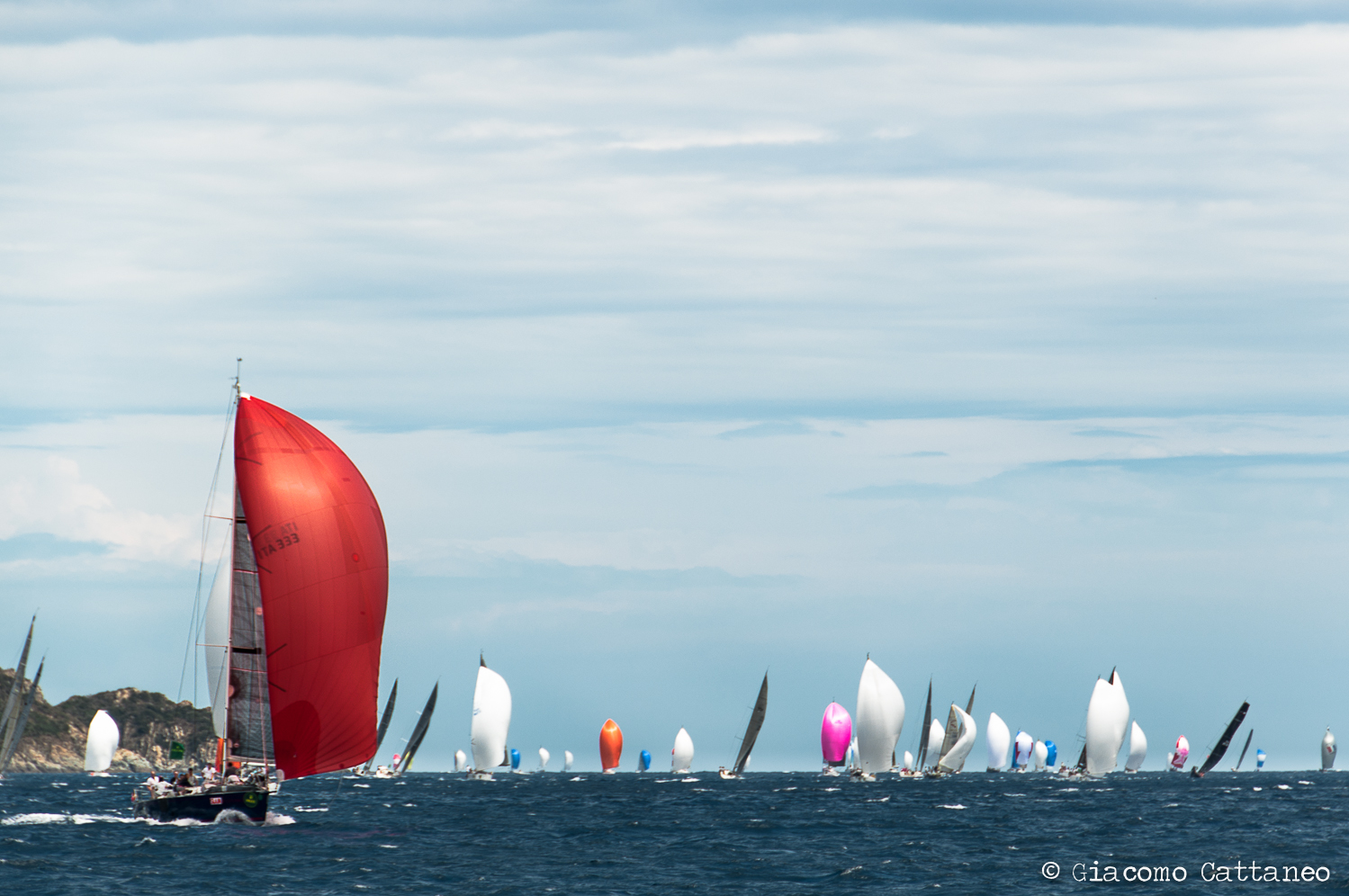
I've never tried sport photography. Still, we found ourselves in the middle of a regata, with some amazing boats passing by enjoying some perfect conditions - a sunny day, and a breeze to fill their sails. You got to take pictures. And I did, I've shot way too much given the general excitement. It became clear that to have a different picture, it needed to capture a "moment". The two above are probably my favourites in that sense: the first, a boat that raised a great red flag as the foreground, with the rest of the pursuer in the back (i.e. giving the idea that the regata was happening, and I did not shot a lonely boat). The contrast between the colours and the subject so present in the foreground are the things I like. Would have been nice to be closer though. The second is something I needed to prepare myself for: I noticed the three boats pursuing each other, and knew that the right "moment" would come - but you either get it or miss it.  I consider myself pretty luck for the final composition that resulted: no overlaps, all three inclined by a similar angle, three different boat colours, a perspective that leads you from the first to the third boat, and an dynamic action happening. 

Clouded days: a broken tree and a floating boat.

A broken tree

A broken tree

A floating boat.

A floating boat.

What do you do when clouds obscure the sky and you have water around? Well, you play with long exposure of course. Lucky me I was in the lovely little bay of Port-Cros. A tripod is strictly necessary, and a ND filter as well. Neutral Density (ND) filters simply decrease the amount of light being captured by the camera. There are the classic "pieces of glass" to be mounted in front of the lens, often of the graduated sort, and those called "variable ND filters": two polarisers mounted onto each other that by changing their relative angle will lead to more or less density, hence the term variable. I have one of the latter sort, more comfortable for travelling. The great thing about them is that they will allow you to keep your shutter open for longer times even if the ambient light is too bright. Hence, even in the middle of the day, by keeping your ISO as low as possible combined with a small aperture (e.g. >f11 --> the smaller the aperture, the less light - careful though that a too small aperture will lead to diffraction, so don't go up to f26), you might be able to shoot for a few seconds, if not more. Why would you want to do it? Because in that time lapse some things are going to move, becoming blurred, while others will not. This is especially true with water (e.g. waterfalls, waves) that gets this effect of becoming all flat and soft, but you can also use it to get e.g. people blurred, or... well, fishes. The important thing is, for me, to have something that will remain still, contrasted by something moving. Or not, I mean, this is all about creativity! The two pictures above are not the greatest examples, because e.g. in the first picture with the branch the water was not moving enough, hence you don't really perceive that any movement was flatten out. In the second I found something moving, the boat, but something in the composition does not convince me 100%. Moreover, the amount of distortion due to the short focal length (18mm) of my kit lens does not go unnoticed in the corners and the straight lines. 

Sun-less sunset.

Sun-less sunset.

Sun-less sunset.

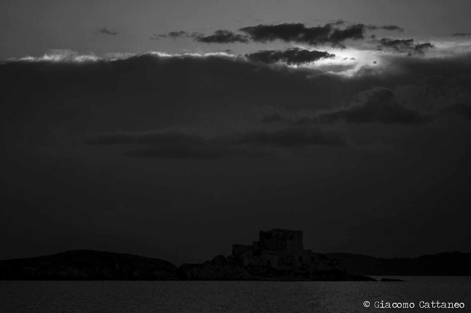
If the sun had been there, it would have been a great, yet normal, picture of a sunset behind a fort on an island. I personally welcomed the clouds, and with such a straight-line formation. It allowed for something different, a very dark picture with a soft spot of light. Nothing special about technique or composition to talk about, just wanted to share it. I would love to see this picture printed big. Or better yet, huge! 


These are a few pictures I wanted to share out of my week of vacation. They are not as special as some of the others on the website, but it's not always that you have the opportunity to shoot street life in coloured and exciting countries. Still, I would like to see your opinion on them, and feedback as always! So don't be afraid of being critique and share your opinion =)


Cheers,

Giacomo

A weekend in Israel by Giacomo Cattaneo

Not long ago I was lucky enough to visit Israel - a country everybody knows the name of, but that few are able to really grasp in their minds. And it is indeed different than whatever I imagined before. Tel Aviv with its easy-going atmosphere with an embedded religiousness was a real surprise. Together with my girlfriend I visited a friend, so I would not say it was the most adventurous trip, rather a long weekend of relax. Hence, I did not go around with my camera often as I did when I was travelling the world - still, once we got to Jerusalem, it was very difficult to keep it in the bag! There are a few pictures from that day that I would like to share with you, and maybe tell you a bit more about how the shot came to be and what I was trying to achieve. 

Under David's Cross.

Under David's Cross

Under David's Cross

This is probably my favourite picture of the trip, and a very lucky shot - we were simply wandering around the back alleys of Jerusalem, when I saw this little girl in a bright red dress that caught my attention. I liked the fact that she was on her dad's shoulders, and that there would be kind of a tunnel in which they would go in. Never would I have ever imagined, that there would even be a flag of Israel hanging there (I think I noticed it only later, and of course was enthusiastic about it!) - I had to be really quick, and consider myself really lucky that somehow I got the focus right. In the post processing I noticed that the shadows on the dad/kid were really strong, while I wanted the subject to really stand out. I started by brightening the shadows overall in Lightroom, and worked a bit more with the 50% grey layer method in photoshop for the dad/kid subject, as well as for the flag. Enough to bring them out, not too much so that they look surreal. Moreover, I used a bit of the high-pass filter on them to further bring them out. As a final retouch, I toned down the saturation overall of the surroundings, so that the subjects' colour would pop up even more. 


Gold and Dishes.

Gold and Dishes

Gold and Dishes

I would call this a failed experiment. When walking on top of some rooftops (nothing crazy, just a different path that many people use instead of the alleys) I noticed the gold cupola of the temple mount amidst multiple satellite dishes - I though "there is something there!". I only took a few shots, but did not spend a lot of time thinking creatively - they were basically all from the same angle. Only later at home I noticed how cool the concept could have been, but also how the overall framing that I chose was bad as it did not bring out neither the cupola nor the dishes, as they are embedded in a chaotic background. I should have gotten closer and a bit below, to have the cupola stand out from the houses' horizon, and also used a larger aperture so to have the background more blurred. So what do you do when the composition fails you and cannot retake the shot? You try different things, like b/w or experimenting with colours, something that I usually never do as I do not like  when I get an picture that people would mistake for an instagram shot. Still, as most the instagram shots do, it looked better than the original... so what can I say. I am so disappointed with this shot that I was/am ready to accept such an unrealistic result. Too bad for me =)


Two Doors.

Two Doors

Two Doors

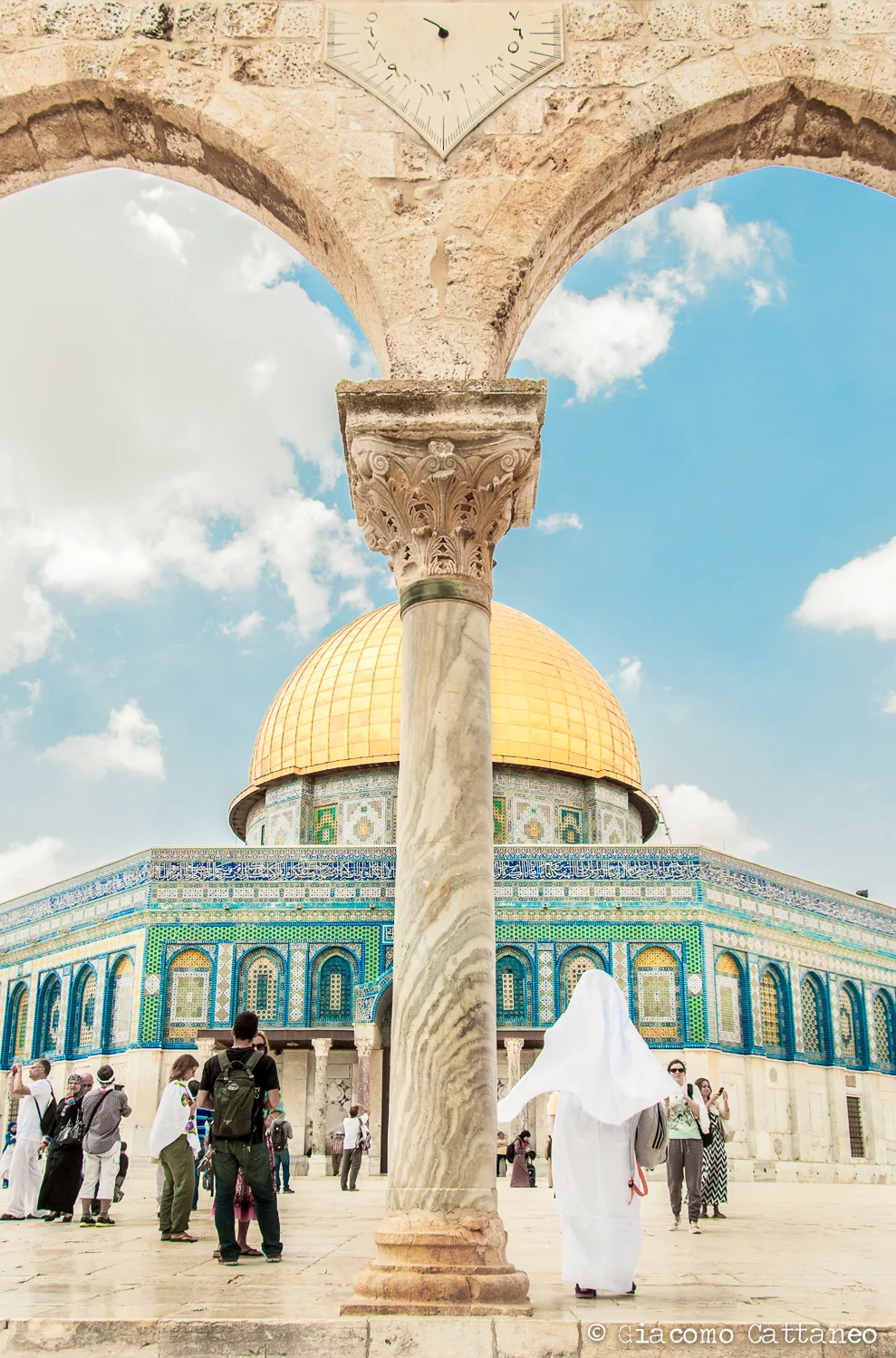
Jerusalem's Temple Mount poses the usual dilemma to a travel photographer: you have a majestic and beautiful subject, that has been framed in every possible way and is displayed on posters and postcards all over the city. Still, you want to take a picture that will somehow be  different than all of those - or at least try. The rule would be to add something unique and unrepeatable to such a picture, either an event or a person. I don't really think I succeeded well in that regard, but let's say that I at least tried. When this schoolgirl passed in front of my camera with her pure white cloth, it caught my eye. Adding my passion for geometry and "windows" I got this sort of shot. Nothing really special I would say, but still, on some level different than the usual tourist picture. If I could change something, I would have taken the picture from a bit more distance, so to have more in the frame and be able afterwards to get the vertical lines of the temple straight in Lightroom. Moreover, if I had had a tripod with me, I could have taken a long exposure so to get the fix the subjects of the columns and the temple, but get some cloud movement and hopefully the people blurred as they walked around. With the risk of having the girl in white cloth blurred as well.


Shots at the Western Wall: a Holy Kiss and Generations

Holy Kiss

Holy Kiss

Generations

Generations

The Western Wall - a great place, where the religious atmosphere is stronger than many holy sites I have visited. It has maybe more meaning than a simple church, as this is the if not the only real holy place for Judaism. In italian the place is called "il muro del pianto", i.e. the wall of the crying (p.s. I found out later that there is also the name Wailing Wall). Not to sound disrespectful, I believe that overall, the place does not only display sad emotions related to the tragic history of the Jews, but also some more joyful ones represented for example by the fathers bringing their kids to discover a place which is the symbol of the long journey their people have experienced over three thousands of years. You can imagine then that is not an easy place to take pictures, as (and rightfully so) in no way should a tourist like me intrude. We could still debate if I should have taken pictures at all. But I did, my apologies if I involuntarily offended somebody.  So I kept my camera in my bag most of the time, and only when I noticed a shot where I knew I would not bother anybody, I took it out. The first case are the kids praying, reading from the Torah (or a simpler prayer book), and kissing the wall. I am a bit annoyed that I did not get the full hand, but the important thing was for me to capture the kiss (so again, I had to be quick!). Maybe it's not the best angle, but what I like about it is that there is action, there is a "moment". So if you want, similarly to the discussion I made before with the temple mount, it's unique. Of course everyday hundreds of people kiss the wall - but maybe this kid won't for another year before his uncles bring him back on his yearly trip from Tel Aviv. In the post-processing in Lightroom I did a few things, including bringing down the highlights, increasing the shadows, and increasing the clarity. For the colours I increased the vibrance, but compensated with decreasing the saturation. Additionally, I decreased the saturation of the reds and oranges, so to keep the warm tones but no reddish skin. Again, similarly as the first picture I used the 50% gray overlay burning/dodging method and high-pass filter to bring out the subject and his features a bit more. 

The second picture is this man that I knew I could quickly bother because... well, he seemed very much into his praying and totally disconnected from what was happening around him. I like the fact that you can really see his nose pressed against the wall, and the harsh features of his face being evidenced by the strong shadows. Once I turned the picture in b/w I strongly increased the clarity in Lightroom to bring out even more contrast, and used the 50% grey overlay method to burn/dodge the details even more. I hope I did not go too far - once you start, you get a bit anaesthetised toward the right amount and easily go overboard. I also like the two kids behind him, as they offer a second subject to the picture, maybe contrasting as they represent two generations (hence the title)... hopefully they don't take the focus away from the man. Noticed the small note inserted in the crack at the man's right? A friend suggested me I could have taken a super close-up on the man's face. That would have been an amazing shot... next time. 


Well, this is it for this time. It was not a trip were I felt very inspired in taking pictures, as I was more on the relaxing-side of things (especially in Tel Aviv). But I got this bunch of shots in Jerusalem that are at least worth discussing - would be nice to hear your comments and suggestions for next time! Which one do you like? What would you have tried / done differently? 


Cheers,

Giacomo

the Aspire project by Giacomo Cattaneo

The Aspire project focuses on providing role-models, mentorship and inspiration for women interested in an entrepreneurial career. The founders are a trio of extremely dynamic people, very connected and involved in the Swiss start-up ecosystem - together they came up with this amazing project. The idea of the launch event was to display the portraits of successful women entrepreneurs that could serve as role models. Because of my interest in entrepreneurship and my passion about photography, I was involved in the project.

It was my first experience as a photographer, meaning that I was hired by somebody else to carry out a photographic project. Very different than my usual “having the camera in the bag and take it out when something exciting happens”, maybe in a distant and exotic country. Here you have a subject: successful women that I had to direct and get the best shot possible. Most of them were not used to photoshootings, and neither was I. Still, it was a great opportunity, and I had a lot of fun!

Every photoshooting was preceded by an hour of interview by an Aspire's member or myself, in which we would discuss the story of our guests and how they came to be entrepreneurs. Fascinating stories that allowed us to get to know our guests, meaning that we knew who we were photographing - we could represent them in a picture with their unique features and qualities, and not as a random models that just had to pose. We agreed that the common denominator would be either a piece of paper or an object that would remind our subjects of the "trigger moment" when they became entrepreneurs. 


Olga - Switzerland

Olga - Switzerland

Olga - Switzerland

Olga is a successful entrepreneur from Ukraine, that told us how her coming to Switzerland opened so many new opportunities, that she eventually took. Considering that her "trigger word" was Switzerland, we tried to find a very cliché image of Zurich. I guess we managed! We joked later that we could send the picture to the Swiss Tourism agency to be used in their promotions! Regarding the picture itself, I had to play quite a lot with the zoom as I wanted to get the three levels: the flag in the front as main subject, Olga still  in focus and the background. To get this sense of depth I avoided using too much zoom as it would compress the picture. We had to turn the final picture into black/white for the exhibition, but I personally prefer the colour version as it shows how great the light was.


Michelle - The Hummingbird Bakery Cookbook

Michelle - The Hummingbird Bakery Cookbook

Michelle - The Hummingbird Bakery Cookbook

This was a fun one - we had all of Michelle's cupcake shop at our disposal, a dreamy place. Her "trigger" was a book - the book that made her decide to embarque on this journey to open a cupcake shop. She was fun and sweet, so I wanted to create a picture that would reflect that, which a lot had to do with her position and expression, but also embed her in the coloured environment of her shop. We thought together about the possibilities, and after several unsatisfactory shots, we decided to try something out of the ordinary - sitting on the counter - with a dreamy expression as if happily remembering the first cupcake she baked. I was so happy she was wearing such leggins, as they really stood out and create a sense of depth in the picture. 


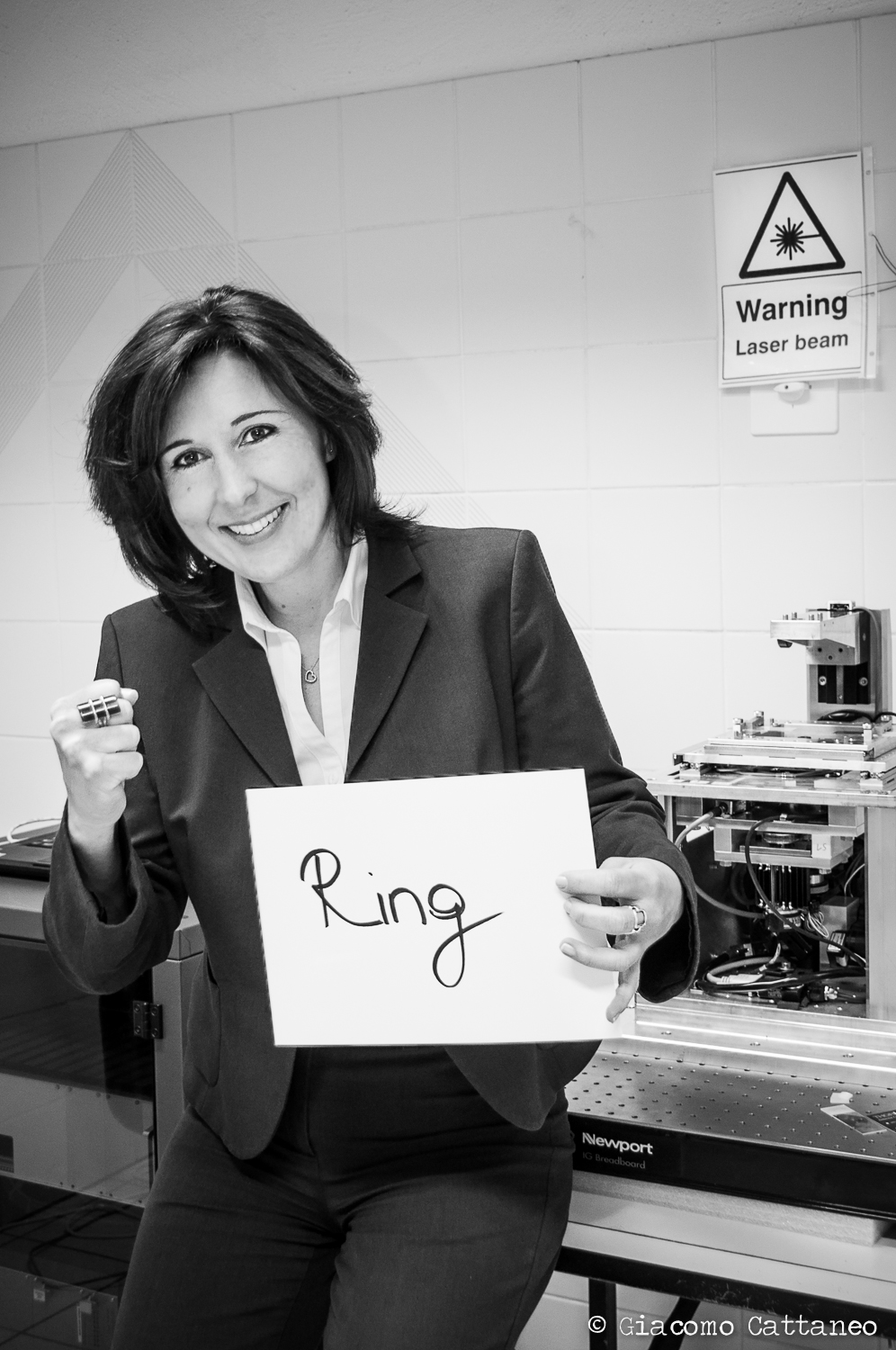
Nicoletta - Ring

Nicoletta - Ring

Nicoletta - Ring

This picture represents one of my favourite stories. Maybe because I got to interview Nicoletta personally, hence I knew her story better than any other of our entrepreneurs. The word Ring is the name of a conference room in which she sat for two hours, and that even had a pair of boxing gloves hanging in the corner. She entered with the aim of selling a technology to a larger company, and she got out as the new CEO of a start-up producing it. Being in an office of course limits the creativity in terms of spaces and light, hence we had to play with the word a bit more  - give me the boxing fist! 


Sabrina & Severin - Road Trip

Sabrina & Severin - Road Trip

Sabrina & Severin - Road Trip

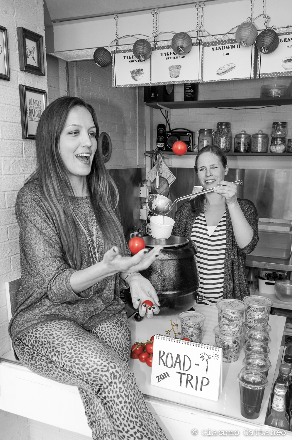
In this case I did not use the word a lot, because I though that the window of Sabrina & Severin's salad shop in Langstrasse was an interesting frame. I decided to shift a bit the angle so to have different subjects: the two girls, both in action, and the notebook with the “trigger word”. Still, the word relates to happy times on the road, and I wanted to bring that into the picture. Having those red tomatoes (ready to be cut and put in a tasty salad) and the green background of the walls, we came up with a few things to do - playing around with them gave the best results, as also the expressions are the most spontaneous! And yeah... i went with the old-fashioned "color-splash".


With no disrespect to the other fantastic subjects, these are the pictures that I thought would be more interesting to comment upon. Not surprisingly, these are also the subjects of which I could listen to their interviews and hence get a bit more creative as I knew their stories better. 

So this would be my take-away from this project - the more you know of the person standing in front of your camera, the easier it is to take a unique shot. I have still a lot to learn, also from a technical perspective, about how to take portraits, but this was absolutely an experience that I would like to repeat =) 

Why a blog? by Giacomo Cattaneo

I want to write a blog. About (my) photography.

You might wonder why, as still do I - well, the reasons are honestly pretty simple. I want to share, I want to self-reflect, and I want motivation.


sharing.

Up to now, I have photographed for me, in the sense that I have rarely been commissioned a project until recently. And I like that - you get to freely follow your style, your subjects, your concepts. This lead often to some pictures that are the result of a distinct process, or of a peculiar story. And that is what I think might be worth start sharing something - not for any kind of presumption that might derive from it, rather for the pleasure of involving people into something that makes me happy and passionate. 

self-reflection.

Reflecting is the only way to learn and grow. When you are forced to put on paper (well, type a post) about the process behind the pictures, or to critically analyse your pictures, you cannot tell nonsense. You cannot fool yourself the same way you can do it in your mind, because you will read what you just wrote. Others will too. Recognising what is good and bad is a great exercise for the photographer himself - hopefully others will help me in the process providing me with constructive feedbacks.

motivation.

Posting on social websites is fun - yet, it is not always a great stimulus for me. I rarely get a chance to express what a photo means to me, what its story is, what I thought in that moment. Publishing some of them in this blog and allowing me to write about what I just mentioned is the kind of motivation that I am looking for. 


I hope you will read some of my posts, and watch some of my pictures. I will welcome any kind of comment, let me feel that I am actually sharing something with somebody! 

Cheers,

Giacomo